



The identity pairs a strong editorial wordmark with a circular mon inspired by seasonal change. The result is a visual system that feels modern, refined and deeply rooted in the idea of seasonality.
CONCEPT
STRONG ENOUGH TO MOVE. CLEAR ENOUGH TO TRUST.
The identity pairs a strong editorial wordmark with a circular mon inspired by seasonal change. The result is a visual system that feels modern, refined and deeply rooted in the idea of seasonality.


SPACE & SIGNAGE
ADD RHYTHM.
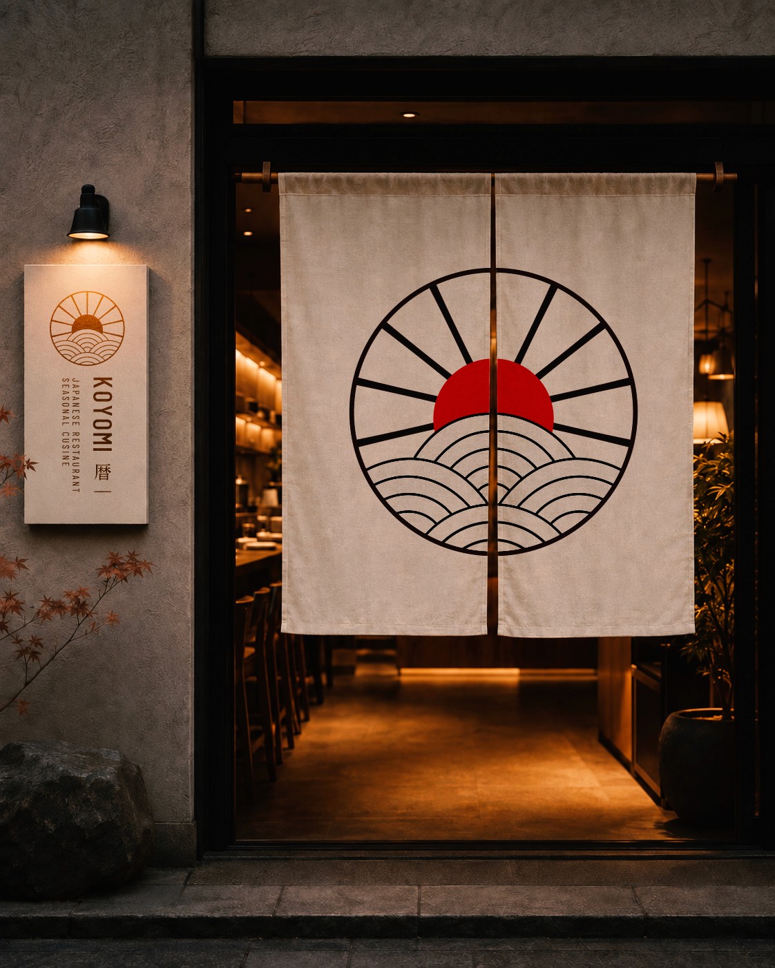
In physical space the identity stays restrained and architectural. The wordmark leads, the mon acts as a quiet signature, and seasonal graphics add rhythm without overwhelming the experience.



ONLINE TOUCHPOINTS.
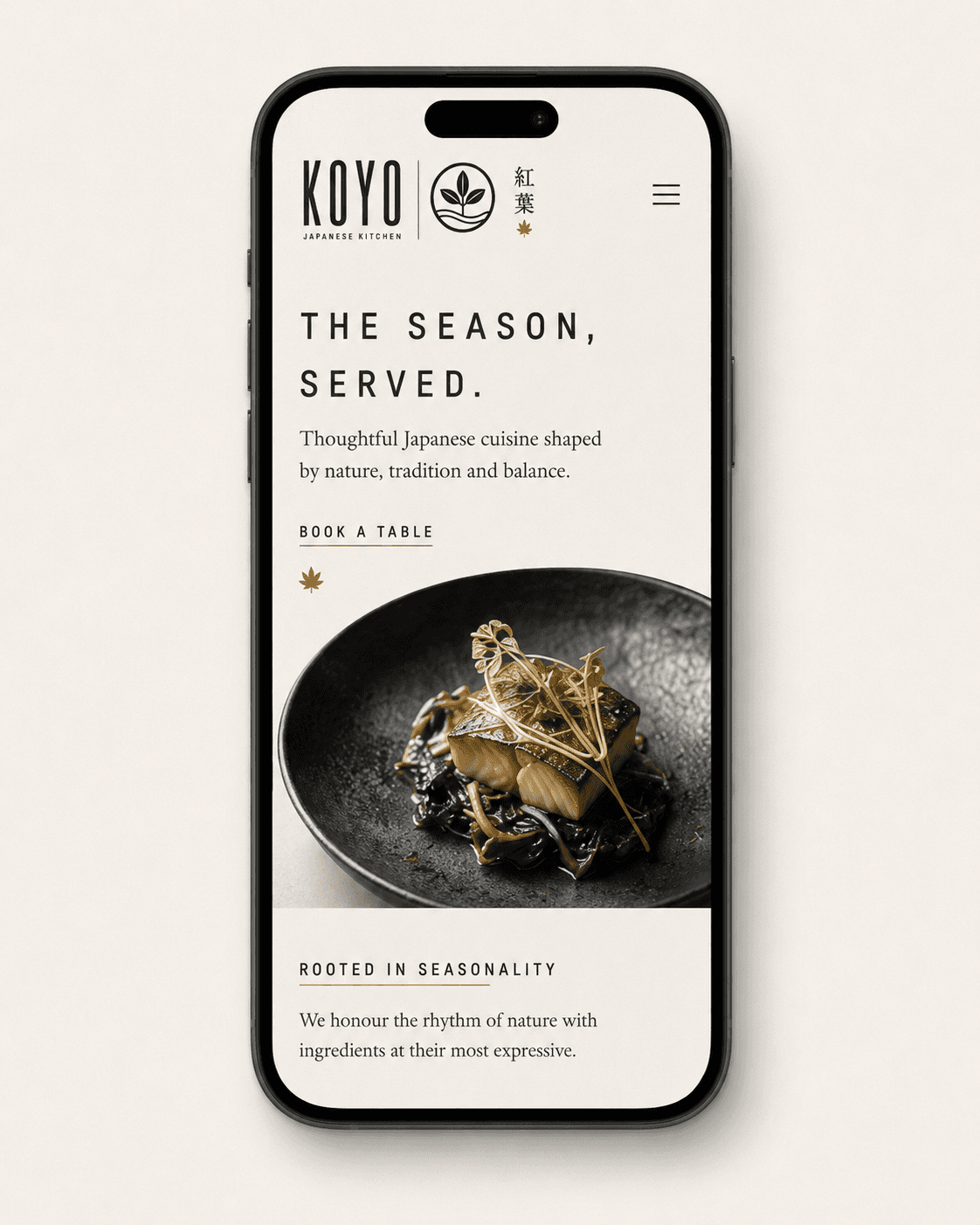
Digital touchpoints translate the same calm hierarchy into web and social. Photography focuses on texture, craft and ingredients at their seasonal peak, giving the brand a quiet but distinctive presence online.



Results
01
+0%
(Label)
Description
02
+0%
(Label)
Description
03
+0%
(Label)
Description
04
+0%
(Label)
Description
project note

Giulia Conti
Founder, Milano
“THE GOAL WASN’T TO CREATE FOUR SEPARATE THINGS. IT WAS TO BUILD ONE IDENTITY THAT COULD LIVE EVERYWHERE.”
Every part of the project was designed to support the next — from the identity and photography to social content and editorial layouts. The result is a flexible visual system that keeps KTZ consistent across every format.
more projects

" width="225.99999025184061px"><path d="M 47.332 18.012 C 40.379 25.557 31.148 35.97 31.148 35.97 C 29.727 36.243 28.305 36.207 26.801 36.025 C 21.598 35.388 21.744 30.646 24.578 22.536 C 18.081 32.657 13.461 36.344 8.167 36.544 C 4.695 36.68 -5.694 34.824 4.093 15.099 C 12.859 -2.55 23.886 -1.003 27.202 1.537 C 28.852 2.802 30.255 4.541 30.1 7.763 C 30.902 6.306 31.722 4.795 32.57 3.221 C 32.579 3.193 32.597 3.166 32.606 3.13 C 32.779 2.72 32.962 2.31 33.144 1.874 C 33.618 0.772 34.839 0.008 36.142 0.008 L 46.065 0.008 C 46.065 0.008 42.94 0.909 40.625 6.051 L 40.598 6.051 C 37.873 12.296 35.486 17.657 33.864 21.917 C 33.845 21.999 33.782 22.09 33.745 22.19 C 33.326 23.255 32.971 24.247 32.679 25.175 C 32.579 25.412 32.506 25.658 32.442 25.894 C 32.223 26.568 32.069 27.178 31.932 27.751 C 31.85 27.988 31.795 28.234 31.759 28.47 C 31.494 29.572 31.303 30.664 31.166 31.72 C 36.242 26.44 40.917 21.343 43.623 18.012 Z M 26.947 13.379 C 28.67 7.226 27.366 4.686 25.562 4.459 C 21.771 3.985 16.969 8.773 12.759 16.892 C 8.549 25.011 8.276 30.882 9.643 32.275 C 12.422 35.097 18.172 28.57 26.938 13.379 Z" fill="rgb(19, 17, 12)" height="36.55031679598643px" id="FkumVzprS" transform="translate(0 19.89)" width="47.33188572955487px"/><path d="M 40.977 3.932 C 36.721 8.219 31.491 18.168 32.548 22.837 C 24.884 23.948 24.875 17.667 26.361 13.981 C 27.509 11.123 29.058 8.392 30.097 6.117 C 23.527 13.58 10.478 32.731 8.546 41.615 C 0.226 42.626 -1.35 39.194 0.973 30.957 C 2.094 27.015 6.623 14.363 11.17 2.002 C 11.598 0.828 12.883 0 14.268 0 L 24.474 0 C 24.474 0 21.476 0.856 19.171 5.743 C 16.556 12.679 13.986 19.797 12.018 25.932 C 18.943 13.753 30.088 0.055 32.73 0.046 L 38.107 0.046 C 40.084 0.046 43.355 1.556 40.986 3.941 Z" fill="rgb(19, 17, 12)" height="41.78705219844212px" id="Wg8II3I9O" transform="translate(38.03 19.852)" width="41.81385021503428px"/><path d="M 54.474 6.317 C 54.474 6.317 54.456 6.317 54.429 6.335 C 52.798 6.626 50.975 8.656 49.444 10.95 C 49.144 11.378 48.861 11.824 48.606 12.27 C 47.758 13.644 47.029 15.037 46.483 16.129 L 28.604 16.129 C 21.806 33.523 13.295 56.871 14.361 61.458 C 6.042 62.477 4.465 59.046 6.789 50.808 C 8.083 46.257 13.942 30.065 19.091 16.12 L 0 16.12 L 1.412 12.261 L 20.521 12.261 C 21.943 8.42 23.273 4.87 24.376 1.939 C 24.804 0.792 26.062 0 27.419 0 L 38.054 0 C 38.054 0 34.955 0.901 32.641 5.989 C 31.875 7.882 31.028 10.003 30.126 12.261 L 38.846 12.261 C 39.53 10.75 40.159 9.348 40.778 7.974 C 41.289 6.836 42.528 6.071 43.867 6.089 L 48.715 6.189 L 48.834 6.189 L 54.474 6.308 Z M 45.098 37.902 L 48.815 37.902 C 41.863 45.447 32.632 55.842 32.632 55.842 C 31.192 56.133 29.743 56.097 28.23 55.915 C 19.537 54.85 25.797 42.325 34.591 21.763 C 35.047 20.662 36.286 19.897 37.589 19.897 L 44.678 19.897 C 40.55 29.509 36.86 37.519 34.782 43.199 C 34.746 43.299 34.7 43.408 34.664 43.508 C 33.853 45.702 33.297 47.541 33.087 48.979 C 33.087 49.052 33.069 49.097 33.051 49.152 C 32.878 49.989 32.75 50.808 32.65 51.609 C 37.726 46.33 42.4 41.233 45.107 37.902 Z" fill="rgb(19, 17, 12)" height="61.632595451408605px" id="ay951ZkLt" transform="translate(67.434 0)" width="54.474331074412476px"/><path d="M 39.907 0 C 38.267 0.91 36.809 2.075 35.524 3.35 C 31.004 7.755 28.534 13.435 28.416 14.472 L 28.416 14.545 C 28.334 14.509 28.243 14.491 28.161 14.445 C 26.675 13.899 25.828 12.934 25.473 11.751 L 25.473 11.715 C 24.999 10.222 25.272 8.383 25.983 6.554 C 22.739 5.871 15.968 5.561 14.073 14.554 C 13.089 19.169 17.253 23.32 20.215 26.961 C 26.083 24.148 31.906 21.572 35.168 20.626 L 34.512 22.892 L 34.448 23.12 C 34.448 23.12 28.07 25.604 21.664 28.854 C 23.595 31.63 25.199 34.652 23.286 38.648 C 18.21 49.252 -7.332 44.983 2.054 37.255 C 5.316 34.579 11.986 31.494 14.046 30.274 C 10.155 26.788 4.878 22.555 4.605 18.104 C 4.505 17.449 4.45 16.821 4.487 16.111 C 5.279 3.313 18.866 0.173 27.222 3.959 C 28.088 2.448 29.136 1.056 30.229 0.009 L 39.907 0.009 Z M 15.804 32.067 C 11.613 34.333 4.277 37.747 3.721 39.485 C 3.585 40.996 7.394 41.315 11.084 40.25 C 16.36 38.056 17.782 35.462 15.804 32.067 Z" fill="rgb(19, 17, 12)" height="44.985038756532674px" id="MlNzkKjhF" transform="translate(107.589 17.285)" width="39.90679786732681px"/><path d="M 47.332 18.012 C 40.379 25.557 31.148 35.97 31.148 35.97 C 29.727 36.243 28.305 36.207 26.801 36.025 C 21.598 35.388 21.744 30.646 24.578 22.536 C 18.081 32.657 13.461 36.344 8.167 36.544 C 4.695 36.68 -5.694 34.824 4.093 15.099 C 12.859 -2.55 23.886 -1.003 27.202 1.537 C 28.852 2.802 30.255 4.541 30.1 7.763 C 30.902 6.306 31.722 4.795 32.57 3.221 C 32.579 3.193 32.597 3.166 32.606 3.13 C 32.788 2.72 32.962 2.31 33.144 1.874 C 33.618 0.772 34.839 0.008 36.142 0.008 L 46.065 0.008 C 46.065 0.008 42.94 0.909 40.625 6.051 L 40.598 6.051 C 37.873 12.296 35.486 17.657 33.864 21.917 C 33.845 21.999 33.782 22.09 33.745 22.19 C 33.326 23.255 32.971 24.247 32.679 25.175 C 32.579 25.412 32.497 25.658 32.442 25.894 C 32.223 26.568 32.069 27.178 31.932 27.751 C 31.85 27.988 31.795 28.234 31.759 28.47 C 31.494 29.572 31.303 30.664 31.166 31.72 C 36.242 26.44 40.917 21.343 43.623 18.012 Z M 26.947 13.379 C 28.67 7.226 27.366 4.686 25.562 4.459 C 21.771 3.985 16.969 8.773 12.759 16.892 C 8.549 25.011 8.276 30.882 9.643 32.275 C 12.422 35.097 18.181 28.57 26.938 13.379 Z" fill="rgb(19, 17, 12)" height="36.55031679598643px" id="jTIaEdW_i" transform="translate(139.22 19.89)" width="47.33188572955417px"/><path d="M 48.741 18.041 C 41.788 25.586 32.557 35.981 32.557 35.981 C 31.117 36.272 29.65 36.236 28.128 36.054 C 19.973 35.062 24.985 23.939 32.931 5.543 C 25.923 12.552 10.532 32.495 8.546 41.606 C 0.226 42.626 -1.35 39.194 0.973 30.957 C 2.094 27.015 6.623 14.363 11.17 2.002 C 11.598 0.828 12.883 0 14.268 0 L 24.474 0 C 24.474 0 21.476 0.856 19.171 5.743 C 16.373 13.153 13.621 20.799 11.608 27.197 C 19.125 14.718 32.548 0.046 35.282 0.036 L 40.658 0.036 C 42.617 0.036 43.875 1.702 43.164 3.35 C 39.865 10.895 36.977 17.331 35.127 22.228 C 34.972 22.573 34.79 23.019 34.617 23.584 C 34.462 24.03 34.298 24.476 34.161 24.885 C 34.097 25.022 34.061 25.158 34.024 25.295 C 33.55 26.688 33.231 27.907 33.04 28.918 C 32.83 29.855 32.685 30.775 32.566 31.676 C 37.615 26.424 42.253 21.363 44.941 18.05 L 48.75 18.05 Z" fill="rgb(19, 17, 12)" height="41.78071304909146px" id="lznO32__e" transform="translate(177.25 19.861)" width="48.74994447547342px"/><path d="M 47.332 18.012 C 40.379 25.557 31.148 35.97 31.148 35.97 C 29.727 36.243 28.305 36.207 26.801 36.025 C 21.598 35.388 21.744 30.646 24.578 22.536 C 18.081 32.657 13.461 36.344 8.167 36.544 C 4.695 36.68 -5.694 34.824 4.093 15.099 C 12.859 -2.55 23.886 -1.003 27.202 1.537 C 28.852 2.802 30.255 4.541 30.1 7.763 C 30.902 6.306 31.722 4.795 32.57 3.221 C 32.579 3.193 32.597 3.166 32.606 3.13 C 32.779 2.72 32.962 2.31 33.144 1.874 C 33.618 0.772 34.839 0.008 36.142 0.008 L 46.065 0.008 C 46.065 0.008 42.94 0.909 40.625 6.051 L 40.598 6.051 C 37.873 12.296 35.486 17.657 33.864 21.917 C 33.845 21.999 33.782 22.09 33.745 22.19 C 33.326 23.255 32.971 24.247 32.679 25.175 C 32.579 25.412 32.506 25.658 32.442 25.894 C 32.223 26.568 32.069 27.178 31.932 27.751 C 31.85 27.988 31.795 28.234 31.759 28.47 C 31.494 29.572 31.303 30.664 31.166 31.72 C 36.242 26.44 40.917 21.343 43.623 18.012 Z M 26.947 13.379 C 28.67 7.226 27.366 4.686 25.562 4.459 C 21.771 3.985 16.969 8.773 12.759 16.892 C 8.549 25.011 8.276 30.882 9.643 32.275 C 12.422 35.097 18.172 28.57 26.938 13.379 Z" fill="transparent" height="36.55031679598643px" id="zkeQ1NRSH" stroke-dasharray="" stroke-linecap="butt" stroke-linejoin="round" stroke-width="17.06" stroke="rgb(19, 17, 12)" transform="translate(0 19.89)" width="47.33188572955487px"/><path d="M 40.977 3.932 C 36.721 8.219 31.491 18.168 32.548 22.837 C 24.884 23.948 24.875 17.667 26.361 13.981 C 27.509 11.123 29.058 8.392 30.097 6.117 C 23.527 13.58 10.478 32.731 8.546 41.615 C 0.226 42.626 -1.35 39.194 0.973 30.957 C 2.094 27.015 6.623 14.363 11.17 2.002 C 11.598 0.828 12.883 0 14.268 0 L 24.474 0 C 24.474 0 21.476 0.856 19.171 5.743 C 16.556 12.679 13.986 19.797 12.018 25.932 C 18.943 13.753 30.088 0.055 32.73 0.046 L 38.107 0.046 C 40.084 0.046 43.355 1.556 40.986 3.941 Z" fill="transparent" height="41.78705219844212px" id="j9Ygn830h" stroke-dasharray="" stroke-linecap="butt" stroke-linejoin="round" stroke-width="17.06" stroke="rgb(19, 17, 12)" transform="translate(38.03 19.852)" width="41.81385021503428px"/><path d="M 54.474 6.317 C 54.474 6.317 54.456 6.317 54.429 6.335 C 52.798 6.626 50.975 8.656 49.444 10.95 C 49.144 11.378 48.861 11.824 48.606 12.27 C 47.758 13.644 47.029 15.037 46.483 16.129 L 28.604 16.129 C 21.806 33.523 13.295 56.871 14.361 61.458 C 6.042 62.477 4.465 59.046 6.789 50.808 C 8.083 46.257 13.942 30.065 19.091 16.12 L 0 16.12 L 1.412 12.261 L 20.521 12.261 C 21.943 8.42 23.273 4.87 24.376 1.939 C 24.804 0.792 26.062 0 27.419 0 L 38.054 0 C 38.054 0 34.955 0.901 32.641 5.989 C 31.875 7.882 31.028 10.003 30.126 12.261 L 38.846 12.261 C 39.53 10.75 40.159 9.348 40.778 7.974 C 41.289 6.836 42.528 6.071 43.867 6.089 L 48.715 6.189 L 48.834 6.189 L 54.474 6.308 Z M 45.098 37.902 L 48.815 37.902 C 41.863 45.447 32.632 55.842 32.632 55.842 C 31.192 56.133 29.743 56.097 28.23 55.915 C 19.537 54.85 25.797 42.325 34.591 21.763 C 35.047 20.662 36.286 19.897 37.589 19.897 L 44.678 19.897 C 40.55 29.509 36.86 37.519 34.782 43.199 C 34.746 43.299 34.7 43.408 34.664 43.508 C 33.853 45.702 33.297 47.541 33.087 48.979 C 33.087 49.052 33.069 49.097 33.051 49.152 C 32.878 49.989 32.75 50.808 32.65 51.609 C 37.726 46.33 42.4 41.233 45.107 37.902 Z" fill="transparent" height="61.632595451408605px" id="Ki39r6NkQ" stroke-dasharray="" stroke-linecap="butt" stroke-linejoin="round" stroke-width="17.06" stroke="rgb(19, 17, 12)" transform="translate(67.434 0)" width="54.474331074412476px"/><path d="M 39.907 0 C 38.267 0.91 36.809 2.075 35.524 3.35 C 31.004 7.755 28.534 13.435 28.416 14.472 L 28.416 14.545 C 28.334 14.509 28.243 14.491 28.161 14.445 C 26.675 13.899 25.828 12.934 25.473 11.751 L 25.473 11.715 C 24.999 10.222 25.272 8.383 25.983 6.554 C 22.739 5.871 15.968 5.561 14.073 14.554 C 13.089 19.169 17.253 23.32 20.215 26.961 C 26.083 24.148 31.906 21.572 35.168 20.626 L 34.512 22.892 L 34.448 23.12 C 34.448 23.12 28.07 25.604 21.664 28.854 C 23.595 31.63 25.199 34.652 23.286 38.648 C 18.21 49.252 -7.332 44.983 2.054 37.255 C 5.316 34.579 11.986 31.494 14.046 30.274 C 10.155 26.788 4.878 22.555 4.605 18.104 C 4.505 17.449 4.45 16.821 4.487 16.111 C 5.279 3.313 18.866 0.173 27.222 3.959 C 28.088 2.448 29.136 1.056 30.229 0.009 L 39.907 0.009 Z M 15.804 32.067 C 11.613 34.333 4.277 37.747 3.721 39.485 C 3.585 40.996 7.394 41.315 11.084 40.25 C 16.36 38.056 17.782 35.462 15.804 32.067 Z" fill="transparent" height="44.985038756532674px" id="KYJ_yUF5N" stroke-dasharray="" stroke-linecap="butt" stroke-linejoin="round" stroke-width="17.06" stroke="rgb(19, 17, 12)" transform="translate(107.589 17.285)" width="39.90679786732681px"/><path d="M 47.332 18.012 C 40.379 25.557 31.148 35.97 31.148 35.97 C 29.727 36.243 28.305 36.207 26.801 36.025 C 21.598 35.388 21.744 30.646 24.578 22.536 C 18.081 32.657 13.461 36.344 8.167 36.544 C 4.695 36.68 -5.694 34.824 4.093 15.099 C 12.859 -2.55 23.886 -1.003 27.202 1.537 C 28.852 2.802 30.255 4.541 30.1 7.763 C 30.902 6.306 31.722 4.795 32.57 3.221 C 32.579 3.193 32.597 3.166 32.606 3.13 C 32.788 2.72 32.962 2.31 33.144 1.874 C 33.618 0.772 34.839 0.008 36.142 0.008 L 46.065 0.008 C 46.065 0.008 42.94 0.909 40.625 6.051 L 40.598 6.051 C 37.873 12.296 35.486 17.657 33.864 21.917 C 33.845 21.999 33.782 22.09 33.745 22.19 C 33.326 23.255 32.971 24.247 32.679 25.175 C 32.579 25.412 32.497 25.658 32.442 25.894 C 32.223 26.568 32.069 27.178 31.932 27.751 C 31.85 27.988 31.795 28.234 31.759 28.47 C 31.494 29.572 31.303 30.664 31.166 31.72 C 36.242 26.44 40.917 21.343 43.623 18.012 Z M 26.947 13.379 C 28.67 7.226 27.366 4.686 25.562 4.459 C 21.771 3.985 16.969 8.773 12.759 16.892 C 8.549 25.011 8.276 30.882 9.643 32.275 C 12.422 35.097 18.181 28.57 26.938 13.379 Z" fill="transparent" height="36.55031679598643px" id="Fh7XHK6XS" stroke-dasharray="" stroke-linecap="butt" stroke-linejoin="round" stroke-width="17.06" stroke="rgb(19, 17, 12)" transform="translate(139.22 19.89)" width="47.33188572955417px"/><path d="M 48.741 18.041 C 41.788 25.586 32.557 35.981 32.557 35.981 C 31.117 36.272 29.65 36.236 28.128 36.054 C 19.973 35.062 24.985 23.939 32.931 5.543 C 25.923 12.552 10.532 32.495 8.546 41.606 C 0.226 42.626 -1.35 39.194 0.973 30.957 C 2.094 27.015 6.623 14.363 11.17 2.002 C 11.598 0.828 12.883 0 14.268 0 L 24.474 0 C 24.474 0 21.476 0.856 19.171 5.743 C 16.373 13.153 13.621 20.799 11.608 27.197 C 19.125 14.718 32.548 0.046 35.282 0.036 L 40.658 0.036 C 42.617 0.036 43.875 1.702 43.164 3.35 C 39.865 10.895 36.977 17.331 35.127 22.228 C 34.972 22.573 34.79 23.019 34.617 23.584 C 34.462 24.03 34.298 24.476 34.161 24.885 C 34.097 25.022 34.061 25.158 34.024 25.295 C 33.55 26.688 33.231 27.907 33.04 28.918 C 32.83 29.855 32.685 30.775 32.566 31.676 C 37.615 26.424 42.253 21.363 44.941 18.05 L 48.75 18.05 Z" fill="transparent" height="41.78071304909146px" id="iACzPUIMS" stroke-dasharray="" stroke-linecap="butt" stroke-linejoin="round" stroke-width="17.06" stroke="rgb(19, 17, 12)" transform="translate(177.25 19.861)" width="48.74994447547342px"/><path d="M 47.332 18.012 C 40.379 25.557 31.148 35.97 31.148 35.97 C 29.727 36.243 28.305 36.207 26.801 36.025 C 21.598 35.388 21.744 30.646 24.578 22.536 C 18.081 32.657 13.461 36.344 8.167 36.544 C 4.695 36.68 -5.694 34.824 4.093 15.099 C 12.859 -2.55 23.886 -1.003 27.202 1.537 C 28.852 2.802 30.255 4.541 30.1 7.763 C 30.902 6.306 31.722 4.795 32.57 3.221 C 32.579 3.193 32.597 3.166 32.606 3.13 C 32.779 2.72 32.962 2.31 33.144 1.874 C 33.618 0.772 34.839 0.008 36.142 0.008 L 46.065 0.008 C 46.065 0.008 42.94 0.909 40.625 6.051 L 40.598 6.051 C 37.873 12.296 35.486 17.657 33.864 21.917 C 33.845 21.999 33.782 22.09 33.745 22.19 C 33.326 23.255 32.971 24.247 32.679 25.175 C 32.579 25.412 32.506 25.658 32.442 25.894 C 32.223 26.568 32.069 27.178 31.932 27.751 C 31.85 27.988 31.795 28.234 31.759 28.47 C 31.494 29.572 31.303 30.664 31.166 31.72 C 36.242 26.44 40.917 21.343 43.623 18.012 Z M 26.947 13.379 C 28.67 7.226 27.366 4.686 25.562 4.459 C 21.771 3.985 16.969 8.773 12.759 16.892 C 8.549 25.011 8.276 30.882 9.643 32.275 C 12.422 35.097 18.172 28.57 26.938 13.379 Z" fill="rgb(255, 255, 255)" height="36.55031679598643px" id="YF6BVW5P5" transform="translate(0 19.89)" width="47.33188572955487px"/><path d="M 40.977 3.932 C 36.721 8.219 31.491 18.168 32.548 22.837 C 24.884 23.948 24.875 17.667 26.361 13.981 C 27.509 11.123 29.058 8.392 30.097 6.117 C 23.527 13.58 10.478 32.731 8.546 41.615 C 0.226 42.626 -1.35 39.194 0.973 30.957 C 2.094 27.015 6.623 14.363 11.17 2.002 C 11.598 0.828 12.883 0 14.268 0 L 24.474 0 C 24.474 0 21.476 0.856 19.171 5.743 C 16.556 12.679 13.986 19.797 12.018 25.932 C 18.943 13.753 30.088 0.055 32.73 0.046 L 38.107 0.046 C 40.084 0.046 43.355 1.556 40.986 3.941 Z" fill="rgb(255, 255, 255)" height="41.78705219844212px" id="mjEJLznal" transform="translate(38.03 19.852)" width="41.81385021503428px"/><path d="M 54.474 6.317 C 54.474 6.317 54.456 6.317 54.429 6.335 C 52.798 6.626 50.975 8.656 49.444 10.95 C 49.144 11.378 48.861 11.824 48.606 12.27 C 47.758 13.644 47.029 15.037 46.483 16.129 L 28.604 16.129 C 21.806 33.523 13.295 56.871 14.361 61.458 C 6.042 62.477 4.465 59.046 6.789 50.808 C 8.083 46.257 13.942 30.065 19.091 16.12 L 0 16.12 L 1.412 12.261 L 20.521 12.261 C 21.943 8.42 23.273 4.87 24.376 1.939 C 24.804 0.792 26.062 0 27.419 0 L 38.054 0 C 38.054 0 34.955 0.901 32.641 5.989 C 31.875 7.882 31.028 10.003 30.126 12.261 L 38.846 12.261 C 39.53 10.75 40.159 9.348 40.778 7.974 C 41.289 6.836 42.528 6.071 43.867 6.089 L 48.715 6.189 L 48.834 6.189 L 54.474 6.308 Z M 45.098 37.902 L 48.815 37.902 C 41.863 45.447 32.632 55.842 32.632 55.842 C 31.192 56.133 29.743 56.097 28.23 55.915 C 19.537 54.85 25.797 42.325 34.591 21.763 C 35.047 20.662 36.286 19.897 37.589 19.897 L 44.678 19.897 C 40.55 29.509 36.86 37.519 34.782 43.199 C 34.746 43.299 34.7 43.408 34.664 43.508 C 33.853 45.702 33.297 47.541 33.087 48.979 C 33.087 49.052 33.069 49.097 33.051 49.152 C 32.878 49.989 32.75 50.808 32.65 51.609 C 37.726 46.33 42.4 41.233 45.107 37.902 Z" fill="rgb(255, 255, 255)" height="61.632595451408605px" id="jaE6RaNAn" transform="translate(67.434 0)" width="54.474331074412476px"/><path d="M 39.907 0 C 38.267 0.91 36.809 2.075 35.524 3.35 C 31.004 7.755 28.534 13.435 28.416 14.472 L 28.416 14.545 C 28.334 14.509 28.243 14.491 28.161 14.445 C 26.675 13.899 25.828 12.934 25.473 11.751 L 25.473 11.715 C 24.999 10.222 25.272 8.383 25.983 6.554 C 22.739 5.871 15.968 5.561 14.073 14.554 C 13.089 19.169 17.253 23.32 20.215 26.961 C 26.083 24.148 31.906 21.572 35.168 20.626 L 34.512 22.892 L 34.448 23.12 C 34.448 23.12 28.07 25.604 21.664 28.854 C 23.595 31.63 25.199 34.652 23.286 38.648 C 18.21 49.252 -7.332 44.983 2.054 37.255 C 5.316 34.579 11.986 31.494 14.046 30.274 C 10.155 26.788 4.878 22.555 4.605 18.104 C 4.505 17.449 4.45 16.821 4.487 16.111 C 5.279 3.313 18.866 0.173 27.222 3.959 C 28.088 2.448 29.136 1.056 30.229 0.009 L 39.907 0.009 Z M 15.804 32.067 C 11.613 34.333 4.277 37.747 3.721 39.485 C 3.585 40.996 7.394 41.315 11.084 40.25 C 16.36 38.056 17.782 35.462 15.804 32.067 Z" fill="rgb(255, 255, 255)" height="44.985038756532674px" id="KkmvQgP6U" transform="translate(107.589 17.285)" width="39.90679786732681px"/><path d="M 47.332 18.012 C 40.379 25.557 31.148 35.97 31.148 35.97 C 29.727 36.243 28.305 36.207 26.801 36.025 C 21.598 35.388 21.744 30.646 24.578 22.536 C 18.081 32.657 13.461 36.344 8.167 36.544 C 4.695 36.68 -5.694 34.824 4.093 15.099 C 12.859 -2.55 23.886 -1.003 27.202 1.537 C 28.852 2.802 30.255 4.541 30.1 7.763 C 30.902 6.306 31.722 4.795 32.57 3.221 C 32.579 3.193 32.597 3.166 32.606 3.13 C 32.788 2.72 32.962 2.31 33.144 1.874 C 33.618 0.772 34.839 0.008 36.142 0.008 L 46.065 0.008 C 46.065 0.008 42.94 0.909 40.625 6.051 L 40.598 6.051 C 37.873 12.296 35.486 17.657 33.864 21.917 C 33.845 21.999 33.782 22.09 33.745 22.19 C 33.326 23.255 32.971 24.247 32.679 25.175 C 32.579 25.412 32.497 25.658 32.442 25.894 C 32.223 26.568 32.069 27.178 31.932 27.751 C 31.85 27.988 31.795 28.234 31.759 28.47 C 31.494 29.572 31.303 30.664 31.166 31.72 C 36.242 26.44 40.917 21.343 43.623 18.012 Z M 26.947 13.379 C 28.67 7.226 27.366 4.686 25.562 4.459 C 21.771 3.985 16.969 8.773 12.759 16.892 C 8.549 25.011 8.276 30.882 9.643 32.275 C 12.422 35.097 18.181 28.57 26.938 13.379 Z" fill="rgb(255, 255, 255)" height="36.55031679598643px" id="YAhdFYPF1" transform="translate(139.22 19.89)" width="47.33188572955417px"/><path d="M 48.741 18.041 C 41.788 25.586 32.557 35.981 32.557 35.981 C 31.117 36.272 29.65 36.236 28.128 36.054 C 19.973 35.062 24.985 23.939 32.931 5.543 C 25.923 12.552 10.532 32.495 8.546 41.606 C 0.226 42.626 -1.35 39.194 0.973 30.957 C 2.094 27.015 6.623 14.363 11.17 2.002 C 11.598 0.828 12.883 0 14.268 0 L 24.474 0 C 24.474 0 21.476 0.856 19.171 5.743 C 16.373 13.153 13.621 20.799 11.608 27.197 C 19.125 14.718 32.548 0.046 35.282 0.036 L 40.658 0.036 C 42.617 0.036 43.875 1.702 43.164 3.35 C 39.865 10.895 36.977 17.331 35.127 22.228 C 34.972 22.573 34.79 23.019 34.617 23.584 C 34.462 24.03 34.298 24.476 34.161 24.885 C 34.097 25.022 34.061 25.158 34.024 25.295 C 33.55 26.688 33.231 27.907 33.04 28.918 C 32.83 29.855 32.685 30.775 32.566 31.676 C 37.615 26.424 42.253 21.363 44.941 18.05 L 48.75 18.05 Z" fill="rgb(255, 255, 255)" height="41.78071304909146px" id="qrA4ugska" transform="translate(177.25 19.861)" width="48.74994447547342px"/><path d="M 0 9.712 L 1.021 7.282 C 1.841 7.737 2.779 8.247 4.483 8.247 C 4.811 8.247 5.759 8.146 5.759 7.591 C 5.759 7.082 5.085 7 4.483 6.854 C 2.433 6.399 0.282 5.607 0.282 3.213 C 0.282 1.001 2.296 0 4.483 0 C 6.242 0 7.518 0.446 8.602 1.083 L 7.554 3.495 C 6.935 3.067 5.522 2.722 4.483 2.722 C 4.219 2.722 3.536 2.785 3.536 3.213 C 3.536 3.586 3.927 3.75 4.483 3.887 C 6.078 4.233 9.012 4.87 9.012 7.591 C 9.012 10.022 6.679 10.986 4.483 10.986 C 1.494 10.986 0.328 9.839 0 9.712 Z M 14.698 2.813 L 11.372 2.813 L 11.372 0.173 L 21.15 0.173 L 21.15 2.813 L 17.815 2.813 L 17.815 10.795 L 14.698 10.795 Z M 24.011 0.173 L 28.704 0.173 C 31.967 0.173 33.643 2.057 33.643 4.369 C 33.643 5.598 33.087 6.863 31.967 7.628 L 33.953 10.795 L 30.39 10.795 L 29.178 8.52 C 28.85 8.556 28.668 8.565 28.404 8.565 L 27.128 8.565 L 27.128 10.795 L 24.011 10.795 Z M 28.741 5.926 C 29.707 5.926 30.345 5.225 30.345 4.369 C 30.345 3.513 29.688 2.813 28.75 2.813 L 27.128 2.813 L 27.128 5.926 L 28.732 5.926 Z M 36.76 0.173 L 45.207 0.173 L 45.207 2.813 L 39.876 2.813 L 39.876 4.105 L 44.997 4.105 L 44.997 6.708 L 39.876 6.708 L 39.876 8.146 L 45.407 8.146 L 45.407 10.786 L 36.76 10.786 L 36.76 0.164 Z M 48.287 0.173 L 56.734 0.173 L 56.734 2.813 L 51.403 2.813 L 51.403 4.105 L 56.525 4.105 L 56.525 6.708 L 51.403 6.708 L 51.403 8.146 L 56.935 8.146 L 56.935 10.786 L 48.287 10.786 L 48.287 0.164 Z M 62.575 2.813 L 59.24 2.813 L 59.24 0.173 L 69.018 0.173 L 69.018 2.813 L 65.683 2.813 L 65.683 10.795 L 62.566 10.795 L 62.566 2.813 Z M 71.123 0.173 L 74.321 0.173 L 75.469 6.126 C 75.515 6.417 75.588 6.663 75.633 6.945 C 75.697 6.663 75.752 6.499 75.834 6.126 L 77.228 0.173 L 80.326 0.173 L 81.702 6.126 C 81.784 6.499 81.83 6.663 81.903 6.945 C 81.967 6.663 82.021 6.472 82.085 6.126 L 83.361 0.173 L 86.432 0.173 L 83.744 10.795 L 80.463 10.795 L 79.023 5.043 C 78.923 4.669 78.859 4.342 78.777 3.978 C 78.695 4.342 78.631 4.669 78.531 5.043 L 77.091 10.795 L 73.829 10.795 L 71.141 0.173 Z M 89.102 0.173 L 97.549 0.173 L 97.549 2.813 L 92.218 2.813 L 92.218 4.105 L 97.339 4.105 L 97.339 6.708 L 92.218 6.708 L 92.218 8.146 L 97.749 8.146 L 97.749 10.786 L 89.102 10.786 L 89.102 0.164 Z M 104.648 0.173 L 107.864 0.173 L 112.165 10.795 L 108.985 10.795 L 108.493 9.421 L 104.028 9.421 L 103.536 10.795 L 100.356 10.795 L 104.657 0.173 Z M 107.655 7.018 L 106.388 3.432 C 106.288 3.168 106.27 3.067 106.26 3.004 C 106.26 3.004 106.224 3.149 106.133 3.432 L 104.866 7.018 Z M 114.835 0.173 L 119.528 0.173 C 122.79 0.173 124.467 2.057 124.467 4.369 C 124.467 5.598 123.911 6.863 122.79 7.628 L 124.777 10.795 L 121.214 10.795 L 120.002 8.52 C 119.674 8.556 119.492 8.565 119.228 8.565 L 117.943 8.565 L 117.943 10.795 L 114.826 10.795 L 114.826 0.173 Z M 119.556 5.926 C 120.522 5.926 121.159 5.225 121.159 4.369 C 121.159 3.513 120.503 2.813 119.565 2.813 L 117.943 2.813 L 117.943 5.926 L 119.546 5.926 Z" fill="rgb(18, 17, 12)" height="10.986346657311742px" id="KSu9xSzfS" transform="translate(50.731 77.014)" width="124.77701729220689px"/></g></svg>)


" width="48.00000011237478px"><path d="M 1.127 2.521 L 1.122 2.521 L 1.122 4.163 L 0 4.163 L 0 0 L 1.122 0 L 1.122 1.536 L 2.256 0 L 3.597 0 L 2.054 2.026 L 3.689 4.163 L 2.349 4.163 L 1.128 2.52 Z" fill="rgb(13, 13, 13)" height="4.1629412813787114px" id="MIfuZ_XRM" transform="translate(0.41 1.226)" width="3.689224225624912px"/><path d="M 3.912 3.842 C 3.912 2.88 4.582 2.238 5.592 2.238 C 6.589 2.238 7.259 2.881 7.259 3.842 C 7.259 4.803 6.589 5.445 5.591 5.445 C 4.583 5.445 3.912 4.804 3.912 3.842 M 6.131 3.842 C 6.131 3.455 5.913 3.201 5.585 3.201 C 5.258 3.201 5.034 3.454 5.034 3.842 C 5.034 4.225 5.258 4.483 5.585 4.483 C 5.913 4.483 6.131 4.225 6.131 3.842 M 7.59 4.669 L 8.745 3.212 L 7.617 3.212 L 7.617 2.296 L 10.293 2.296 L 10.299 3.01 L 9.144 4.468 L 10.343 4.468 L 10.343 5.39 L 7.59 5.39 Z M 13.988 2.295 L 13.988 5.389 L 12.941 5.389 L 12.924 5.075 C 12.728 5.311 12.451 5.445 12.097 5.445 C 11.317 5.445 10.668 4.815 10.668 3.859 C 10.668 2.891 11.317 2.239 12.096 2.239 C 12.451 2.239 12.728 2.374 12.925 2.616 L 12.941 2.294 L 13.988 2.294 Z M 12.898 3.842 C 12.898 3.46 12.673 3.201 12.341 3.201 C 12.015 3.201 11.791 3.46 11.791 3.848 C 11.791 4.225 12.015 4.483 12.342 4.483 C 12.674 4.483 12.897 4.23 12.897 3.843 M 14.45 3.842 C 14.45 2.88 15.12 2.238 16.133 2.238 C 16.543 2.238 16.924 2.391 17.207 2.616 L 16.597 3.375 C 16.48 3.257 16.32 3.194 16.155 3.201 C 15.806 3.201 15.578 3.454 15.578 3.842 C 15.578 4.225 15.801 4.483 16.155 4.483 C 16.395 4.483 16.57 4.416 16.695 4.258 L 17.311 5 C 17.011 5.305 16.586 5.445 16.117 5.445 C 15.114 5.445 14.45 4.804 14.45 3.842 M 19.578 5.389 L 18.738 4.337 L 18.738 5.389 L 17.648 5.389 L 17.648 1.001 L 18.738 1.001 L 18.738 3.207 L 19.506 2.295 L 20.88 2.295 L 19.555 3.758 L 20.951 5.388 L 19.578 5.388 Z M 21.08 1.429 C 21.08 1.057 21.341 0.787 21.701 0.787 C 22.061 0.787 22.317 1.057 22.317 1.429 C 22.317 1.8 22.061 2.065 21.701 2.065 C 21.341 2.065 21.08 1.8 21.08 1.429 M 21.151 2.295 L 22.24 2.295 L 22.24 5.389 L 21.151 5.389 Z M 25.483 1.384 L 24.137 1.384 L 24.137 5.389 L 23.957 5.389 L 23.957 1.384 L 22.61 1.384 L 22.61 1.227 L 25.483 1.227 L 25.483 1.384 Z M 26.926 2.396 L 26.905 2.554 C 26.147 2.554 25.739 2.959 25.739 3.6 L 25.739 5.389 L 25.575 5.389 L 25.575 2.452 L 25.739 2.452 L 25.739 3.072 C 25.907 2.599 26.311 2.396 26.926 2.396 M 29.825 2.452 L 29.825 5.22 C 29.825 6.098 29.313 6.683 28.539 6.683 C 28.076 6.683 27.689 6.554 27.389 6.289 L 27.427 6.149 C 27.706 6.373 28.054 6.536 28.533 6.536 C 29.215 6.536 29.662 5.997 29.662 5.192 L 29.662 4.77 C 29.51 5.175 29.171 5.445 28.583 5.445 C 27.885 5.445 27.416 4.984 27.416 4.309 L 27.416 2.452 L 27.58 2.452 L 27.58 4.258 C 27.58 4.883 27.994 5.294 28.621 5.294 C 29.247 5.294 29.662 4.882 29.662 4.258 L 29.662 2.452 L 29.826 2.452 Z M 33.602 3.927 C 33.602 4.837 33.051 5.445 32.234 5.445 C 31.552 5.445 31.138 5.085 30.969 4.567 L 30.969 5.389 L 30.805 5.389 L 30.805 1.001 L 30.969 1.001 L 30.969 3.279 C 31.138 2.756 31.552 2.396 32.234 2.396 C 33.051 2.396 33.602 3.009 33.602 3.927 M 33.422 3.927 C 33.422 3.1 32.931 2.548 32.195 2.548 C 31.46 2.548 30.969 3.1 30.969 3.921 C 30.969 4.748 31.46 5.294 32.195 5.294 C 32.931 5.294 33.422 4.748 33.422 3.927 M 36.887 5.232 L 36.887 5.388 L 33.971 5.388 L 33.971 5.26 L 36.598 1.384 L 34.003 1.384 L 34.003 1.227 L 36.832 1.227 L 36.832 1.356 L 34.211 5.232 Z M 35.268 0.152 C 35.268 0.068 35.333 0 35.415 0 C 35.496 0 35.562 0.068 35.562 0.152 C 35.562 0.236 35.496 0.31 35.414 0.31 C 35.332 0.31 35.267 0.236 35.267 0.152 M 39.894 2.452 L 39.894 5.22 C 39.894 6.098 39.382 6.683 38.608 6.683 C 38.145 6.683 37.757 6.554 37.458 6.289 L 37.496 6.149 C 37.775 6.373 38.123 6.536 38.602 6.536 C 39.284 6.536 39.731 5.997 39.731 5.192 L 39.731 4.77 C 39.578 5.175 39.239 5.445 38.651 5.445 C 37.953 5.445 37.485 4.984 37.485 4.309 L 37.485 2.452 L 37.648 2.452 L 37.648 4.258 C 37.648 4.883 38.063 5.294 38.689 5.294 C 39.315 5.294 39.73 4.882 39.73 4.258 L 39.73 2.452 Z M 40.677 3.915 C 40.677 3.009 41.238 2.396 42.089 2.396 C 42.444 2.396 42.721 2.498 42.978 2.705 L 42.874 2.829 C 42.652 2.64 42.369 2.541 42.079 2.549 C 41.343 2.549 40.852 3.1 40.852 3.921 C 40.852 4.748 41.347 5.294 42.089 5.294 C 42.411 5.294 42.721 5.181 42.957 4.944 L 43.06 5.063 C 42.809 5.316 42.46 5.445 42.068 5.445 C 41.234 5.445 40.677 4.838 40.677 3.915 M 43.691 1.378 C 43.691 1.294 43.756 1.226 43.838 1.226 C 43.92 1.226 43.985 1.294 43.985 1.378 C 43.985 1.462 43.919 1.536 43.837 1.536 C 43.755 1.536 43.691 1.463 43.691 1.378 M 43.762 2.452 L 43.926 2.452 L 43.926 5.389 L 43.762 5.389 Z M 47.511 2.452 L 47.511 5.389 L 47.353 5.389 L 47.347 4.72 L 47.347 4.568 C 47.178 5.085 46.765 5.445 46.083 5.445 C 45.271 5.445 44.72 4.838 44.72 3.927 C 44.72 3.009 45.271 2.396 46.083 2.396 C 46.765 2.396 47.178 2.756 47.347 3.279 L 47.347 3.122 L 47.353 2.452 Z M 47.347 3.921 C 47.347 3.1 46.857 2.549 46.121 2.549 C 45.384 2.549 44.895 3.1 44.895 3.927 C 44.895 4.748 45.385 5.294 46.121 5.294 C 46.858 5.294 47.347 4.748 47.347 3.921 M 27.475 37.294 L 27.475 25.832 L 27.467 12.232 C 27.467 12.232 27.576 7.894 31.197 7.915 C 35.137 7.937 43.883 7.931 43.883 7.931 C 43.883 7.931 48.082 7.53 47.976 12.901 C 47.997 18.312 47.976 12.901 47.976 12.901 C 47.976 12.901 48.033 17.542 47.971 19.162 C 47.932 20.2 47.495 21.883 44.935 21.982 C 41.035 21.963 39.113 21.957 37.462 21.434 C 36.845 21.238 35.925 20.731 35.824 19.419 C 35.723 18.107 35.638 16.701 35.839 15.827 C 36.128 14.563 36.673 13.852 40.514 13.631 C 40.514 13.631 36.868 13.942 36.925 16.658 C 36.961 18.431 37.027 18.676 37.027 18.676 C 37.027 18.676 36.949 20.182 38.988 20.112 L 44.508 19.909 C 44.508 19.909 45.441 19.952 45.465 18.602 C 45.49 17.262 45.465 18.602 45.465 18.602 C 45.465 18.602 45.514 14.022 45.465 12.496 C 45.446 11.881 45.58 10.831 43.644 10.786 C 41.342 10.733 43.644 10.786 43.644 10.786 L 32.049 10.806 C 32.049 10.806 29.949 10.701 29.948 13.606 L 29.977 18.857 L 27.476 62.137 L 27.476 37.294 Z M 20.524 37.294 L 20.524 25.832 L 20.532 12.232 C 20.532 12.232 20.424 7.894 16.803 7.915 C 12.862 7.937 4.117 7.931 4.117 7.931 C 4.117 7.931 -0.082 7.53 0.024 12.901 C 0.002 18.312 0.024 12.901 0.024 12.901 C 0.024 12.901 -0.033 17.542 0.029 19.162 C 0.068 20.2 0.505 21.883 3.065 21.982 C 6.965 21.963 8.887 21.957 10.538 21.434 C 11.155 21.238 12.075 20.731 12.177 19.419 C 12.277 18.107 12.361 16.701 12.161 15.827 C 11.872 14.563 11.327 13.852 7.487 13.631 C 7.487 13.631 11.132 13.942 11.075 16.658 C 11.039 18.431 10.973 18.676 10.973 18.676 C 10.973 18.676 11.051 20.182 9.012 20.112 L 3.492 19.909 C 3.492 19.909 2.559 19.952 2.535 18.602 C 2.51 17.262 2.535 18.602 2.535 18.602 C 2.535 18.602 2.486 14.022 2.535 12.496 C 2.554 11.881 2.42 10.831 4.356 10.786 C 6.658 10.733 4.356 10.786 4.356 10.786 L 15.952 10.806 C 15.952 10.806 18.051 10.701 18.052 13.606 L 18.023 18.857 L 20.524 62.137 Z M 25.23 39.554 C 25.23 56.369 24.116 70 24.116 70 C 24.116 70 23.002 56.369 23.002 39.554 C 23.002 28.694 23.227 19.285 23.555 13.896 C 23.735 10.94 24.116 9.107 24.116 9.107 C 24.116 9.107 24.501 10.946 24.682 13.896 C 25.011 19.283 25.231 28.687 25.231 39.553" fill="rgb(13, 13, 13)" height="70px" id="j6zMhgK6w" width="48.00000011237478px"/></g></svg>)


" height="12.999999840428337px" id="GQtdko8tb" transform="translate(0.36 0.046)" width="60.000000286001125px"/></svg>)
" height="9.724138152129209px" id="R8ux0kG5L" transform="translate(0 1.64)" width="47.00000019999212px"/></svg>)

